What is Responsive Design? A Complete Guide for Modern Websites
What is Responsive Design? A Complete Guide for Modern Websites
At its core, responsive design is all about making your website or app look and feel great on any device. Think of it like water – it effortlessly takes the shape of whatever container you pour it into, whether that's a huge desktop monitor or a tiny smartphone screen. This flexibility is the secret sauce to connecting with people today, wherever they are.
What is Responsive Design, Really?
You know that feeling when you open a website on your phone and have to pinch, zoom, and scroll sideways just to read a single sentence? That’s the classic sign of a non-responsive, or 'static', design. It's frustrating. Static layouts are rigid, built for one specific screen size, and they completely ignore the device you’re actually using.
Responsive design is the modern fix for that broken experience. Instead of a rigid, fixed layout, it’s built on a flexible foundation that automatically rearranges content to perfectly fit the screen. This means text flows, images resize, and menus shift to give you the best possible view, whether you're on your phone, tablet, or even a smart TV.
Responsive vs Static Design At a Glance
The difference really hits home when you put the two approaches side-by-side. One is all about adapting to the user, while the other is stuck in its ways.
Here’s a quick breakdown to show you what I mean:
| Feature | Responsive Design | Static Design |
|---|---|---|
| Layout | Fluid and flexible, adapts to any screen size | Fixed and rigid, designed for one screen size |
| Mobile Experience | Excellent, easy to navigate and read | Poor, requires pinching, zooming, and scrolling |
| Maintenance | One website to manage for all devices | Separate mobile version often needed |
| SEO | Preferred by Google, improves rankings | Can harm rankings due to poor mobile usability |
| Future-Proofing | Adapts to new devices and screen sizes | Becomes outdated as new devices emerge |
Ultimately, a responsive design is about more than just slick tech; it's a completely different way of thinking that puts the user first.
In essence, responsive design isn’t just a technical feature; it's a user-centric philosophy. It prioritises accessibility and usability, ensuring your message reaches your audience clearly and effectively, regardless of how they choose to connect. This adaptability is no longer a luxury—it's a fundamental requirement.
Why a Mobile-First World Demands Responsive Design

Think of your website as your digital storefront. For any UK business, the reality is that most of your customers are now walking in through their phones. Ignoring their experience is like locking your front door during business hours — you're actively turning away sales and chipping away at your brand's reputation with every frustrating pinch and zoom.
A poor mobile experience isn't just a minor hiccup; it's a direct path to lost revenue. When users struggle to navigate your site, they don't stick around to try and figure it out. They simply leave and head straight to a competitor whose site works flawlessly on their device.
This immediate departure hammers your bounce rate and sends a clear signal to search engines that your site isn't valuable, hurting your ability to attract new customers down the line. In short, responsive design isn't just a technical box to tick; it’s a core strategy for survival and growth.
The Real Cost of a Poor Mobile Experience
The huge shift to mobile browsing has completely changed how people behave online. A website that isn't built for smaller screens just feels broken and unprofessional, instantly eroding trust. First impressions are everything, and a clunky mobile interface suggests a lack of care.
A non-responsive site sends a clear message to mobile users: "You're not our priority." This can alienate a huge chunk of your audience, pushing them straight into the arms of competitors who offer a seamless experience on any device.
The damage doesn't stop at a single lost sale, either. A frustrating first visit makes it highly unlikely that a user will ever return, even on a desktop. You don't just lose a potential customer; you diminish your brand's standing in an already crowded market.
By 2025, it's expected that over 90% of UK adults will own a smartphone, making mobile compatibility an absolute must. More importantly, mobile-optimised responsive websites can see up to 40% higher conversion rates compared to sites that aren't optimised. That number alone highlights the direct commercial value of getting this right.
Ultimately, investing in a solid mobile experience is about meeting your customers where they are. You can explore how UK user experience design services drive growth and learn how to turn those mobile visitors into loyal customers. It’s all about making sure your digital door is wide open to everyone, no matter how they choose to visit.
The Three Pillars of Responsive Design
So, how does responsive design actually work its magic? It isn't a single piece of tech but a clever mix of three core techniques working in harmony. Once you understand these pillars, the whole concept clicks into place, moving from an abstract idea to a practical set of tools.
First up is the fluid grid. Picture building your layout with flexible, rubber-like walls instead of rigid brick ones. A fluid grid doesn't use fixed units like pixels; it uses relative units like percentages. This simple change allows the layout to stretch or shrink gracefully to fit any screen, ensuring all your elements stay in proportion, no matter the device.
Next, we have flexible images. It’s no good having a fluid layout if your images are rigid—they’ll just break the design by being too big or too small. Flexible images are coded to resize themselves within their container, automatically scaling up or down to fill their allocated space without overflowing or leaving awkward gaps.
Adapting to Any Screen Size
These first two pillars give us a foundation of flexibility, but it’s the final piece of the puzzle that makes the design truly intelligent. This is where media queries come in.
Think of media queries as simple "if-then" rules for your design. They check for specific conditions—like the screen's width, height, or orientation—and then apply a unique set of style rules based on what they find.
For example, a media query can tell the website: "If the screen is narrower than 768 pixels, stack the columns vertically instead of side-by-side and swap the main menu for a hamburger icon." This allows for much more than just simple resizing; it enables completely different layouts optimised for the best possible experience on each device.
The infographic below really drives home the business benefits of this responsive approach.
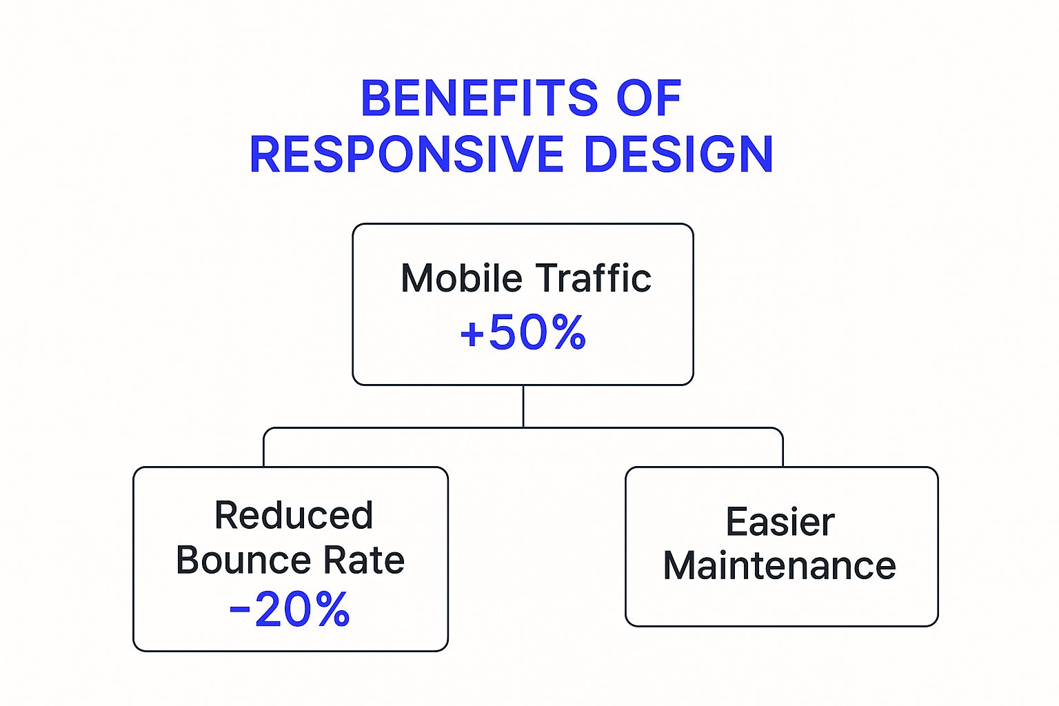
As you can see, a responsive structure leads directly to better performance across the board, including big gains in mobile traffic and impressive reductions in bounce rates.
The Measurable ROI of Responsive Design
Thinking about responsive design as just a cosmetic upgrade is a common mistake. In reality, it’s a hard-nosed business decision that pays for itself over and over again. The most obvious return on investment comes from better visibility on search engines. Google now uses mobile-first indexing, which means it ranks your website based on its mobile version. A responsive site isn't just a "nice-to-have"; it's a direct ticket to better SEO and more organic traffic.
But getting people to your site is only half the battle. You need them to stick around. A smooth, seamless experience is what keeps bounce rates down and session times up. When your site just works, no matter the device, you’re removing all the little frustrations that make people leave. This keeps them on your pages, exploring what you have to offer.
Turning Visitors Into Customers
Ultimately, it all comes down to conversions. This is where responsive design really starts to make a difference to your bottom line. A clunky mobile site is a huge barrier to a sale, creating an awkward and frustrating path from discovery to checkout. Poor design could be costing you customers without you even realising it.
Think of responsive design as your best salesperson. It works 24/7, making sure every single visitor has a smooth, intuitive, and enjoyable experience. That consistency builds trust and directly encourages them to take the next step.
The data backs this up. Recent studies have shown that responsive websites see an 11% higher conversion rate on average. User engagement also gets a 20% boost when a site adapts perfectly to their screen. In the UK specifically, around 68% of users say they’re more likely to spend longer on a responsive website. If you want to dive deeper into the numbers, you can explore more data on how web design influences user behaviour on VWO.com.
Beyond the immediate wins in traffic and sales, you'll also see significant long-term savings. It's far more efficient—and cheaper—to manage one flexible, responsive platform than to build and maintain separate versions for desktop, tablet, and mobile. This unified approach simplifies every update, cuts down on development costs, and makes sure you're ready for whatever new devices come next. Understanding how a poor app design can cost you customers really drives home the financial argument for getting this right from the start.
Why Flutter Is the Ultimate Tool for Responsive Apps
When it comes to building genuinely responsive apps, not all technologies are on a level playing field. This is where Flutter really starts to pull away from the pack. While many frameworks were awkwardly adapted for mobile over time, Flutter was engineered from day one to create beautiful, high-performance apps for mobile, web, and desktop—all from a single codebase.
That foundational difference is everything. It means Flutter isn't constantly trying to stitch together different platform rules. Instead, its entire architecture is built for consistency right out of the box. The framework's brilliant widget-based system gives developers pixel-perfect control over every single element on the screen.
Unmatched Control and Performance
This level of control allows us to craft fluid, adaptive user interfaces that look and feel completely native on any device, no matter the screen size or operating system. We can move beyond just basic responsive layouts and create deeply customised experiences that always feel intuitive and right for the user. The result? A seamless experience, whether they're on an iPhone, an Android tablet, or a desktop computer.
Flutter's 'write once, run anywhere' philosophy isn't just a time-saver. It's about delivering a consistently high-quality, responsive experience that strengthens a brand's presence across every platform, without compromise.
Crucially, all this flexibility doesn't mean sacrificing speed. Recent benchmarks consistently show Flutter's superior performance, ensuring that apps aren't just adaptable but also exceptionally fast and smooth. This is a huge advantage, as a slow-loading app is a sure-fire way to frustrate and lose users. By using a single, optimised codebase, the entire development process becomes leaner and more predictable. For businesses, that means getting to market faster with a more reliable final product.
The Clear Choice for UK Businesses
As UK-based specialists, we lean on Flutter to deliver future-proof, high-quality responsive solutions that give our clients a real competitive edge. It lets us build applications that not only meet today's user expectations but are also primed and ready for the devices of tomorrow.
A few key advantages of using Flutter include:
- Pixel-Perfect UIs: We get total control over the user interface, which means your brand stays consistent and looks flawless on every single device.
- Native Performance: Apps compile directly to native arm code. This translates to fast, smooth performance that feels just as good as a native-built application.
- Single Codebase Efficiency: Faster development cycles and lower maintenance costs are a direct result of managing just one set of code for all platforms.
Understanding what is responsive design is the first step; choosing the right technology to bring it to life is the next. To see how this powerful framework can energise your project, you can learn more about our dedicated Flutter development services. By picking the right tool for the job, you ensure your app is built on a foundation of excellence from the start.
Got Questions About Responsive Design? We've Got Answers

As you start digging into what responsive design could mean for your project, a few common questions always pop up. Getting straight answers is the first step to making smart decisions and avoiding any costly missteps later on.
Responsive vs. Adaptive: What’s the Difference?
This is a big one. Lots of people get these two mixed up.
Think of responsive design as a single, liquid layout. It gracefully stretches or shrinks to fit whatever screen it’s on, like water filling a container. In contrast, adaptive design is more like having a few pre-set Tupperware boxes; it chooses the fixed layout that best fits the device screen.
While both are gunning for a great mobile experience, responsive design is the more flexible, future-proof option. It can handle any new screen size that comes along without needing a total rethink.
How Much Does It Cost and How Long Does It Take?
Naturally, this is often the most pressing question. The truth is, the investment and timeline can vary wildly depending on how complex your site or app is. A simple brochure website might take a few weeks, but a huge e-commerce platform with all the bells and whistles could take several months.
A few things that influence the scope include:
- The number of unique pages and templates that need crafting.
- The complexity of the features you need, like user accounts, payment gateways, or custom interactive bits.
- Whether you’re overhauling an existing site or starting completely from scratch.
A responsive design project is so much more than a fresh coat of paint. It's a strategic investment in your business's digital foundation, ensuring you can connect with your audience effectively for years to come.
This commitment to future-proofing isn’t just a good idea; it’s being recognised at a national level. The SME Digital Adoption Taskforce report pinpoints responsive digital tools as vital for UK businesses, supporting the goal for the country to become a leader in digital capability. The report makes it clear: responsive design is key for businesses to reach consumers on any device. You can dive into the full findings on the official SME Digital Adoption Taskforce report on GOV.UK.
How Can I Check If My Current Site Is Responsive?
There's a really simple, no-tech way to test this.
Just open your website on a desktop computer. Now, click and drag the edge of your browser window to make it narrower and wider. Watch what happens to the content.
Does the text reflow nicely? Do the images resize? Does the whole layout reorganise itself cleanly without anything breaking? If so, you’re probably looking at a responsive design. If you have to scroll sideways to see everything or elements get cut off, your site isn't playing ball.
Ready to build a truly responsive application that looks and performs beautifully on every device? At App Developer UK, we specialise in creating high-performance, future-proof apps using Flutter. Contact us today to bring your vision to life.