User Interface Design Principles: Elevate Your App's UX and Performance
User Interface Design Principles: Elevate Your App's UX and Performance
User interface design principles are the invisible rules that separate a clunky, frustrating app from one that feels intuitive and even delightful to use. They go way beyond just picking nice colours and fonts. We're talking about the core logic that guides how a user actually interacts with your app, turning a functional tool into an enjoyable experience.
Mastering these principles is the key to building apps that users genuinely love and keep coming back to.
Why UI Design Is a Competitive Advantage
In a jam-packed app market, a slick user interface isn't just a nice-to-have anymore—it’s a serious competitive edge. Great UI design isn’t about flashy visuals; it’s about making the entire experience feel effortless. When an app is easy to figure out, it cuts down on user frustration, builds a sense of trust, and naturally encourages people to dive deeper into its features. The direct result? Higher engagement and better user retention.
For UK businesses, getting this right with a Flutter app is a smart, strategic move. Flutter’s way of building UIs makes it incredibly efficient to apply these core principles consistently across both iOS and Android from a single codebase. Plus, recent benchmarks keep showing Flutter at the top of the performance charts, meaning a beautifully designed interface is also a lightning-fast and responsive one. It’s a powerful combination for creating apps that really stand out.

The Tangible Business Impact of Great UI
It’s a common myth that design is just a creative cost on a spreadsheet. The truth is that thoughtful UI delivers a clear, measurable return on investment. Whether it's boosting user satisfaction or directly driving revenue, the impact is undeniable. Think about it: a simpler navigation system can slash the time it takes for a user to make a purchase, which directly bumps up your conversion rates.
In the UK's digital market, we've seen this proven time and time again.
A comprehensive industry review on UX economics found that every £1 invested in user experience can generate up to £100 in return. That's a staggering potential 9,900% ROI when you systematically apply strong UI/UX principles.
This data highlights something crucial: good design is simply good business. For UK companies, especially those in e-commerce, making sure their mobile interface follows these principles is incredibly lucrative. Even a tiny 1–2 percentage point improvement in checkout completion, driven by a clearer UI, can lead to a massive increase in revenue. You can dig deeper by exploring the latest UK web design services industry insights.
Ultimately, when you prioritise user interface design principles, you're investing in the long-term health of your app. You’re not just building a product that works flawlessly; you’re creating one that builds a loyal user base, drives sustainable growth, and cements your brand's reputation in a crowded marketplace.
Building Your App on Foundational UI Pillars
To create an app that feels intuitive and just works, you can't just throw features at the screen and hope for the best. The secret lies in building it on a solid foundation of core user interface design principles. These aren't just fluffy theories; they're the practical, time-tested rules for crafting experiences that guide users without them even realising it.
By getting a handle on four key pillars—Hierarchy, Consistency, Feedback, and Affordance—we can ensure our app communicates clearly and effectively from the get-go.
Think of it like having a conversation. When you follow the unspoken rules of good dialogue, it flows effortlessly. When you ignore them, it becomes awkward, confusing, and frustrating. In the app world, that frustration leads straight to the uninstall button.
The infographic below shows this perfectly. These design principles aren't just a nice-to-have; they're the bedrock. Get them right, and you build great UI, which in turn drives real business impact and gives you a serious competitive edge.
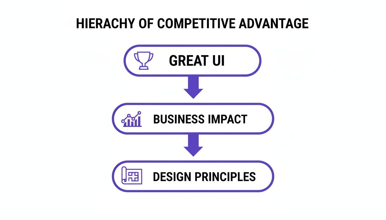
Exceptional UI is never an accident. It’s the direct result of applying these structured principles to create something that feels simple, powerful, and a pleasure to use.
Establishing Clear Visual Hierarchy
Visual hierarchy is all about arranging elements to scream, "Look at me first!" or "I'm less important." Pick up any newspaper, and you'll see it in action. The massive, bold headline grabs your eye, then the subheadings, and finally the smaller article text. This isn't random; it’s a deliberate design choice that tells your brain what to process and in what order.
In a mobile app, the same logic applies. The most critical action or piece of information needs to be the most visually dominant thing on the screen. Simple as that.
- Size and Scale: Bigger elements feel more important. A huge "Add to Basket" button will always win against a tiny text link.
- Colour and Contrast: A splash of bright, contrasting colour makes an element pop. Your primary call-to-action should probably use a bold brand colour, while secondary options can be more muted.
- Placement: We're trained to look at the top and centre of a screen first. Use this to your advantage by placing key elements there.
Getting this right in Flutter is pretty straightforward. We use widgets like Column and Row to lay things out, while tweaking properties like font fontWeight and fontSize lets us control the visual weight of text. A well-organised widget tree naturally creates a clear visual hierarchy for the user.
A strong visual hierarchy cuts down the mental effort required from your users. It lets them scan a screen and understand what to do in seconds, turning a confusing jumble of options into a clear roadmap.
The Power of Unwavering Consistency
Consistency is the magic ingredient that makes an app feel predictable and trustworthy. Think about walking into a supermarket. You instinctively know where to find similar items, and the signage follows the same pattern down every aisle. This predictability makes the whole experience quick and painless.
Your app needs to offer that same comfortable familiarity. When buttons, icons, and menus look and behave the same way on every single screen, users build confidence. They don't have to constantly second-guess how to use your app, which means they can focus on what they actually want to achieve.
To get a head start, it's often wise to explore established user interface design frameworks which provide structured guidelines and ready-made components.
For us Flutter developers in the UK, this is one of the framework's biggest strengths. By defining a central ThemeData object, we can apply colours, fonts, and styles consistently across the entire app from one place. Taking it a step further by creating our own reusable widgets cements this principle, guaranteeing that a specific element looks and acts identically, no matter where it appears.
Providing Meaningful Feedback
Feedback is your app’s way of saying, "Got it!" When you press a button on your TV remote, a little LED blinks to confirm it received the signal. It’s a tiny detail, but without it, you'd be jabbing at the button, wondering if it's broken.
That's exactly what happens in an app without feedback. Users are left in the dark, questioning if their tap registered or if the app has crashed. Good feedback can be:
- Visual: A button changing colour when pressed, a loading spinner popping up, or an item animating smoothly into a shopping basket.
- Auditory: A subtle "swoosh" sound to confirm a message has been sent.
- Haptic: A gentle vibration on the phone to acknowledge an action, like rearranging apps on your home screen.
Flutter makes this dead simple. Widgets like InkWell or GestureDetector give you those nice visual ripple effects on tap, right out of the box. Animations can also provide fantastic feedback, showing users that a process has started or, even better, has finished successfully. This back-and-forth dialogue is crucial for making an app feel responsive and alive.
Clarifying Actions with Affordance
Affordance is simply a visual clue that hints at how you should interact with something. A physical doorknob just looks like it should be turned, while a flat plate on a door invites you to push it. These cues are so ingrained in our minds that we don't even consciously process them.
In a digital UI, affordance tells users what’s tappable, what’s swipable, and what’s editable. A button with a subtle shadow looks three-dimensional and "pressable," while blue, underlined text has screamed "I'm a hyperlink!" for decades.
When these cues are missing, users are forced to play a guessing game. "Can I tap this? Or is it just a label?" Good UI design eliminates that guesswork entirely, making the user's path through your app obvious and intuitive.
Designing for Everyone with Inclusive UI
Building a great app is about more than just smooth navigation and a slick interface. It's about making sure everyone, regardless of their ability, can pick it up and have a fantastic experience. That’s the real heart of inclusive design—treating accessibility not as a final tick-box exercise, but as a core ingredient of great UI from the very beginning.
For any business, this is more than just good ethics; it's a commercial reality. An app that ignores accessibility is effectively turning away a huge chunk of its potential market before it even launches. By thinking inclusively from day one, you build a product that’s not only easier to use for everybody but also reaches the widest possible audience.
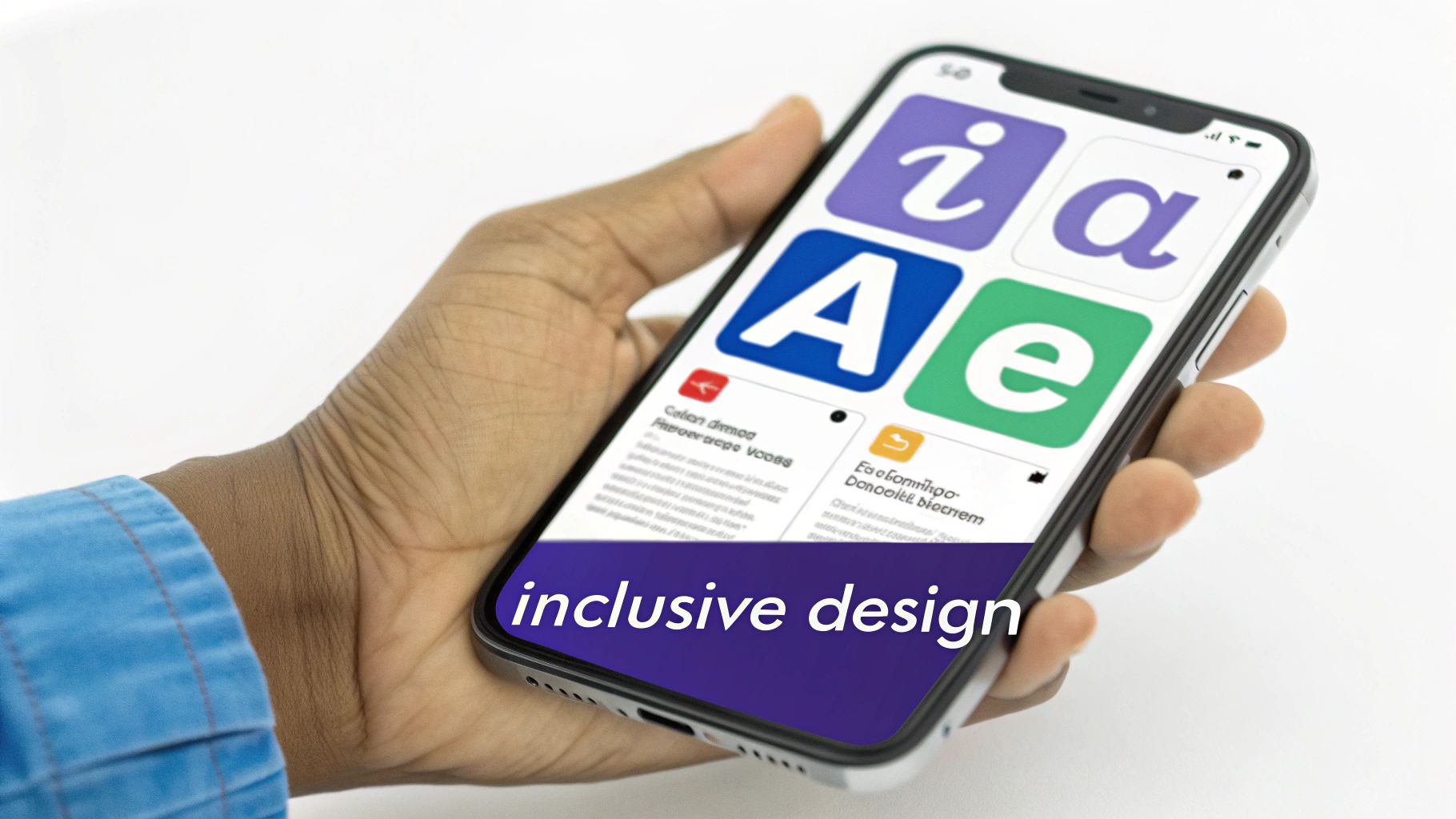
This matters, especially here in the UK where nearly 1 in 5 people live with some form of disability. When an interface fails on basic accessibility, a business risks shutting out up to 20% of its potential users. On the flip side, Microsoft found that applying inclusive design principles can boost usability for all users by around 30%. It’s simple: a more accessible app is just a better app, period.
Key Pillars of Accessible UI Design
Making your app accessible doesn't mean you need to start from scratch. Often, it just comes down to paying attention to a few crucial areas during design and development. Small tweaks can make a world of difference.
Here are the big ones to focus on:
- Colour and Contrast: Make sure there’s enough contrast between your text and its background. This is absolutely vital for users with visual impairments. There are plenty of free tools out there to check if your colour palette meets the Web Content Accessibility Guidelines (WCAG) standards.
- Alternative Text (Alt Text): Every important image, button, or icon needs a descriptive text alternative. This is what screen readers use to describe visual elements to users who can't see them, ensuring they get the same information and context as everyone else.
- Dynamic Font Sizes: People need to be able to adjust the font size in their device settings and see your app’s text scale up or down without breaking the layout. Hard-coding font sizes is a classic mistake that can make an app completely unusable for many.
It's also smart to be aware of the regulatory side of things. For a deeper dive into the legal standards, the guide to ADA Website Compliance is a really useful resource, offering solid insights that apply broadly to digital accessibility.
A Quick Checklist for Your App
Running a quick audit can reveal surprising gaps. This simple checklist is a great starting point for developers and product owners to get a feel for how accessible their app really is.
| Check | Why It Matters | Simple Test |
|---|---|---|
| Colour Contrast | Ensures text is readable for users with low vision or colour blindness. | Use a free online contrast checker with your app’s primary colours. |
| Tap Target Size | Small buttons are frustrating for everyone, but impossible for users with motor impairments. | Can you easily and accurately tap every interactive element with your thumb? |
| Screen Reader Support | Users with visual impairments rely on screen readers (like VoiceOver/TalkBack) to navigate. | Turn on your device’s screen reader and try to complete a core task. Is it logical? |
| Scalable Text | Allows users with low vision to increase the font size to a comfortable level. | Go to your device’s accessibility settings and max out the font size. Does your app’s layout hold up? |
| Clear Link/Button Text | Vague labels like "Click Here" give no context to screen reader users. | Read your button labels out of context. Do they still make sense? "Add to Basket" is much better than "Submit". |
This isn't an exhaustive list, but it covers the most common and high-impact issues. Getting these right puts you miles ahead.
How Flutter Makes Accessibility Easier
For us as Flutter developers, building inclusive apps is genuinely easier thanks to the framework's DNA. Flutter was designed with accessibility in mind from the ground up, giving us widgets and tools that do most of the heavy lifting.
A core principle of inclusive design is providing an equivalent experience for all users. Flutter's
Semanticswidget is a perfect example, allowing developers to annotate the UI with descriptions that make it understandable to screen readers and other assistive technologies.
This means we can ensure that our custom-designed buttons, complex animations, and interactive lists are all properly described and navigable for anyone using tools like TalkBack on Android or VoiceOver on iOS. Instead of accessibility being a patch-up job at the end, we can weave it directly into the widget tree as we build.
Ultimately, this saves a huge amount of development time and results in a more robust, truly inclusive experience. Flutter proves you don't have to sacrifice a beautiful, high-performance UI to make an app that works for everyone.
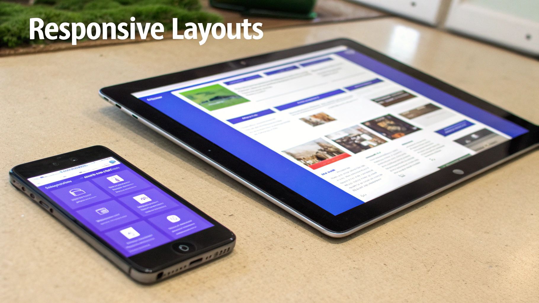
Achieving Flawless Responsive Layouts in Flutter
A beautiful UI on a single device is a great start, but what happens when that app lands on a screen twice the size, or half as wide? A truly professional app delivers a flawless experience on every screen, and that's where responsive design comes in. It’s one of the most important user interface design principles we have.
The whole idea is to create fluid, adaptable layouts that look just as polished on a small phone as they do on a massive tablet, no matter the orientation.
Without it, things fall apart quickly. Elements get crammed together, text becomes unreadable, and crucial buttons might even disappear off-screen. It’s a jarring experience that makes an app feel broken and unprofessional, completely undermining all the hard work you’ve put in.
This is where Flutter really comes into its own. As a UK-based Flutter agency, we know its architecture was fundamentally built for creating high-performance, responsive UIs from a single codebase. You don't have to fight the framework to make layouts adapt; Flutter gives you powerful, out-of-the-box tools designed for exactly this challenge.
Core Strategies for Adaptive UIs
Building a responsive layout isn’t about making dozens of separate designs for every possible screen size. That would be a nightmare. Instead, it’s about setting flexible rules that let the UI reflow and reorganise itself intelligently. It's a foundational concept that goes beyond just apps, and you can dive deeper in our complete guide on what is responsive design.
For mobile apps, the key strategies boil down to:
- Handling Screen Density: Making sure your images and icons look crisp and sharp on both standard and high-resolution displays (like Apple's Retina screens).
- Adapting to Orientation: Ensuring the layout works perfectly whether the user is holding their device in portrait or landscape mode.
- Managing Aspect Ratios: Dealing with the huge variety of screen shapes out there, from tall, narrow phones to much wider tablets.
Nailing these areas guarantees a consistent, high-quality experience for every user, no matter what device they’re on. It also future-proofs your app, so it’s ready for new devices as they hit the market.
Mastering Flutter's Layout Widgets
Flutter has a rich set of widgets that make all of this remarkably straightforward. Instead of writing messy conditional logic to check for screen sizes, you can use widgets that automatically adapt their children. This is a massive advantage that streamlines development and leads to much cleaner, more maintainable code.
Here are some of the most powerful tools in Flutter’s layout toolkit:
| Widget | Primary Use Case | How It Creates Responsiveness |
|---|---|---|
Expanded | Fills available space within a Row or Column. | Prevents those dreaded pixel overflow errors by letting widgets shrink or grow to fit the screen without hard-coded sizes. |
Flexible | Similar to Expanded, but can have a "loose" fit. | Gives you more control over how space is shared, allowing some widgets to take only the space they need while others expand. |
LayoutBuilder | Provides the parent widget's constraints to its child. | Lets you build completely different widget trees based on the available space, like showing a simple list on a small screen and a detailed grid on a larger one. |
MediaQuery | Gives access to screen size, orientation, and other properties. | Perfect for making high-level layout decisions based on device characteristics, like switching to a two-pane view on a tablet. |
These widgets are the true building blocks of any properly responsive Flutter app.
By using widgets like
ExpandedandLayoutBuilder, you stop thinking in terms of fixed pixels and start designing with flexible constraints. This shift in mindset is the key to building UIs that feel custom-made for every screen.
Ultimately, getting responsive layouts right is non-negotiable in modern app development. It’s a design principle that directly impacts usability, professionalism, and user satisfaction. With its incredible performance and purpose-built layout system, Flutter gives UK developers the ideal framework to build beautiful, adaptive applications that deliver a consistently excellent experience to everyone.
Avoiding Common UI Design Pitfalls
Knowing the core user interface design principles is one thing, but seeing what happens when they’re ignored is a much more powerful lesson. Even the most well-intentioned apps can fail spectacularly if they fall into common design traps that frustrate users and hide functionality. A great UI isn't just about what you add; it's about the friction you remove.
So many of these mistakes come from a simple failure to see things from the user’s perspective. An icon that seems totally obvious to you might be a complete mystery to a new user. A navigation system that makes perfect sense to the developer could feel like a maze to someone just trying to get one simple thing done.
Learning to spot these pitfalls in your own work is a huge step towards creating a genuinely professional and user-friendly app.
The Ambiguous Icon Problem
One of the most frequent slip-ups is using icons that don't clearly signal what they do. It’s tempting to choose an icon for its cool, aesthetic vibe rather than its universal meaning, but this leaves users guessing. This is a classic violation of the 'affordance' principle we talked about earlier.
Before: An app uses a highly stylised, abstract icon for its critical 'save' function. Users pause, unsure if tapping it will save their work, share it, or something else entirely. That moment of hesitation adds to their mental workload and chips away at their confidence in the app.
After: The abstract icon is swapped for a universally recognised floppy disk or checkmark symbol. The function is now instantly clear, requiring zero thought. This simple change removes friction and makes the whole experience feel much more intuitive.
Inconsistent Navigation and Cluttered Interfaces
Another major pitfall is inconsistency. When buttons, links, and menus show up in different places or look different from one screen to the next, it shatters the user's mental model of your app. This forces them to relearn the layout for each new section—a perfect recipe for frustration and, eventually, abandonment.
Just as damaging is the cluttered interface, where every spare pixel is jammed with information. This "more is more" approach completely overwhelms users, making it impossible to spot the most important actions. A cluttered screen is a sure sign of a missing visual hierarchy, leaving everything screaming for attention at once.
A cluttered interface is often a sign of unclear priorities. By forcing every feature to be visible at once, you ensure that none of them truly stand out, making the app difficult to scan and use effectively.
This is a critical point where poor design can hit your bottom line directly. In fact, understanding how a confusing or poorly organised app design could be costing you customers is essential knowledge for any product owner. The fix always comes back to applying those core principles.
Before: A settings screen presents dozens of options in one long, daunting list with no visual breaks. Crucial settings are buried among trivial ones, and the user has to painstakingly scan the whole thing to find what they need.
After: The settings are neatly grouped into logical categories like 'Profile', 'Notifications', and 'Security', using clear headings and generous white space. This simple reorganisation uses hierarchy and consistency to turn a confusing mess into a clear, scannable menu. By making clarity the priority, you empower people to navigate your app with confidence.
Working with the Pros for Top-Tier UI Design
Getting a handle on user interface design principles is more than just a box-ticking exercise; it’s a strategic move that can make or break your app's success. As we've seen, a well-thought-out UI is what drives growth, keeps users happy, and carves out a strong brand identity, especially in the crowded UK market. But knowing the theory is one thing—putting it into practice flawlessly is another game entirely.
This is especially true when you're working within the high-performance world of Flutter. The framework's real magic is its power to deliver a fast, beautiful, natively compiled experience from just one codebase. To turn that raw potential into a polished, intuitive app that people genuinely enjoy using, you need a specialist's touch. A seasoned partner makes sure these core principles aren't just tacked on at the end, but are baked into the very fabric of your app from day one.
From Principles to Production
The real challenge is bridging the gap between design theory and the nuts and bolts of technical implementation. This is where a specialised agency shines. They are masters at translating concepts like hierarchy, consistency, and accessibility into clean, robust, and maintainable Flutter code. This process sidesteps the common pitfalls that can send a project off the rails, ensuring the final product isn't just functional, but an absolute pleasure to use.
A partnership goes way beyond a simple service. It’s about having an expert team that acts as a guardian for your user's experience, making smart decisions that tie great UI design directly to your business goals.
Their expertise means your app's UI will be cohesive, responsive, and perform brilliantly, no matter the device. By checking out the benefits of dedicated UX design services that transform mobile apps, you can get a clearer picture of how this kind of collaboration elevates the final product.
The Value of Home-Grown UK Talent
The soaring demand for skilled UI and UX professionals here in the UK shows just how seriously businesses are taking interface design. The field has professionalised rapidly, and clients now rightly expect a formal, principle-led approach to every project. This shift is reflected across the market, with strong career outlooks for UX designers, where senior roles can pull in salaries of £60,000–£85,000+. You can read more on the demand for UX design in the UK.
When you partner with a UK-based Flutter agency, you get direct access to this pool of top-tier talent. It means your app is being built by a team that not only gets the technical nuances of the Flutter framework but also has its finger on the pulse of the local market. The result? A world-class application that delivers real, measurable business results.
Got Questions About UI Design?
Dipping your toes into the world of app development always throws up a few common questions, especially around the core principles of design. Getting your head around these fundamentals is the first step to understanding why they're so crucial for building an app that people actually want to use.
Let's break down some of the most common queries we get from our partners and clients right here in the UK.
What’s the Real Difference Between UI and UX Design?
It’s a classic question, and an important one. Think of it like this: UI (User Interface) design is the look and feel. It’s the colours, the fonts, the buttons, the animations—all the visual and interactive bits you touch and see. It’s about making the app beautiful and easy to interact with on a surface level.
UX (User Experience) design, on the other hand, is the entire journey. It’s the deep thinking behind the scenes—the user research, the information architecture, the usability testing—that ensures the app isn't just pretty, but genuinely solves a user's problem in the most intuitive way possible. A brilliant UI is a massive part of a great UX, but it’s only one piece of a much bigger puzzle.
How Can I Tell if My App's UI Design Is Actually Working?
You need to look at both the cold, hard data and what real people are saying. Relying on just one won't give you the full story.
A two-pronged approach is best:
- Look at the numbers: These are your quantitative metrics. What’s your task success rate? Can people actually complete the main actions you want them to? How long does it take them (time-on-task)? And, of course, are they hitting your conversion goals, like signing up or making a purchase?
- Listen to your users: This is where you get the "why." Qualitative insights from user surveys, App Store reviews, and proper usability testing sessions are gold. Watching someone struggle with a feature tells you more than any spreadsheet ever could.
Why Does Everyone Go On About Consistency in UI Design?
Because consistency is what makes an app feel familiar and trustworthy. When buttons, icons, and actions all behave in the same predictable way across every screen, users don't have to stop and think. They learn the rules of your app once and can then navigate with confidence.
This predictability is vital because it dramatically lowers the user's cognitive load—that's the mental gymnastics required to figure out how to use something. The less brainpower they have to spend on navigating, the more they can focus on what they're actually trying to achieve.
This is one of the areas where a framework like Flutter really shines. By setting up a central ThemeData and building a shared library of reusable widgets, developers can enforce consistency effortlessly. It's baked in from the start, ensuring the entire app feels polished, professional, and completely cohesive.
Ready to transform your app's interface into a powerful asset? The expert team at App Developer UK specialises in building high-performance, user-centric Flutter applications that deliver real results. Contact us today to discuss your project.